Create a brand identity for a recycling business that revolutionises how end-of-life tyres are processed, appealing to multiple audiences.
The Brief: Re-Tyre needed a complete brand identity that would establish them as credible innovators in the tyre recycling sector.
The Brand's Audience
The brand needed to appeal to three distinct audiences:
Trade customers: Companies looking to integrate better tyre waste processing into their operations
Investors: Those seeking opportunities in sustainable technologies
Manufacturers: Partners in the processing equipment supply chain
WHAT THEY WANTED
The Vibe
The brand identity needed to appear trustworthy and established, essential when persuading businesses to change their existing waste management processes.
WHAT WE DID
The Inspiration
Our design team began by immersing themselves in research, exploring:
Current automotive industry branding to understand visuals that would feel familiar to the target audience
Competitors in both the automotive and recycling sectors
Visual elements from tyre treads that could inform unique brand patterns
Colour psychology specific to automotive aftermarket and environmental sectors
From this foundation, we developed a concept that merged the universally recognised recycling symbol with distinctive elements representing Re-Tyre’s innovative approach.
The Outcome
Logo Development
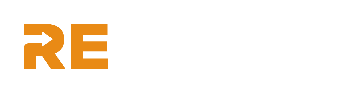
The primary logo features three arrows that mirror those in the globally recognised recycling sign, with strategic white space showing they’re ingrained into the business as a true circular solution. We created a flexible logo system consisting of:
A primary logo with slogan for general use
A secondary logo without slogan for space-restricted applications
A standalone logo mark for use as website favicon, social profiles and pattern creation
Brand Assets
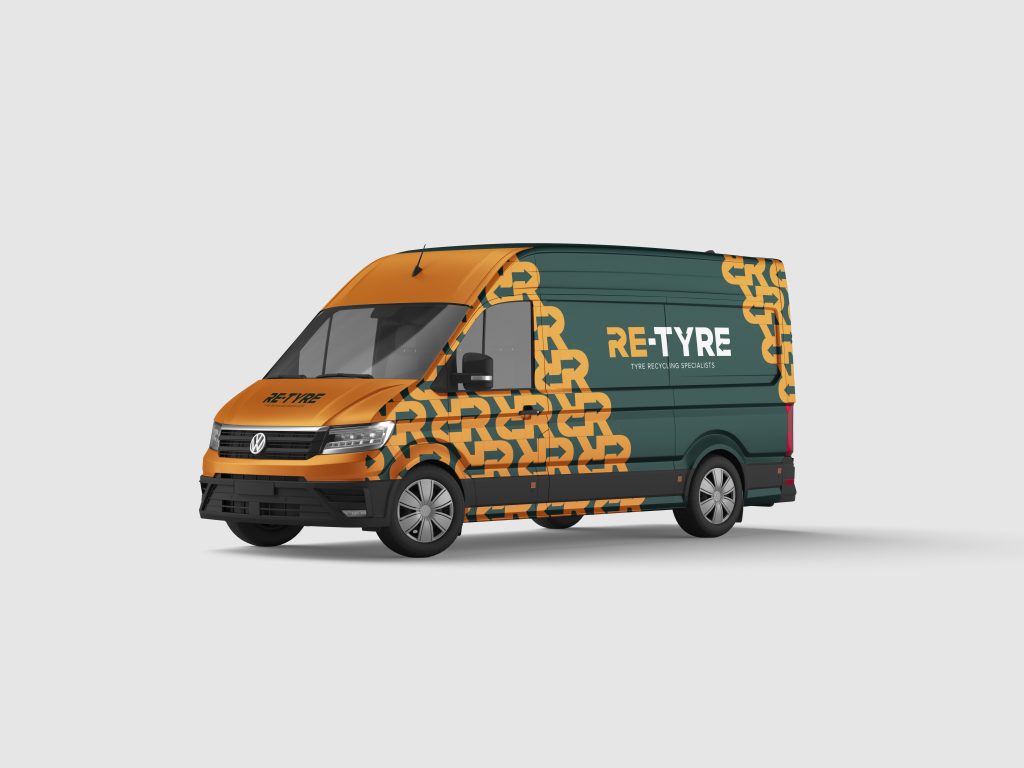
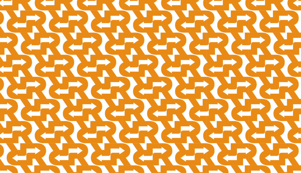
We transformed the logo mark into distinctive brand patterns resembling tyre treads, creating a consistent visual language that could be applied across all brand touchpoints.
Colour Palette
Our research-informed colour selection includes:
Orange: Selected for its strong resonance with aftermarket/trade departments within the automotive industry
Green: The universal colour for sustainability, recycling and circular economy initiatives
Dark Green: Introduced specifically for investor-facing communications requiring a more corporate feel
Supporting neutrals: Warm white and white to provide contrast and balance
Typography
We chose Proxima Nova for its clean appearance and bold impact, using three weights to establish clear hierarchy across all communications.
We Also Delivered:
The primary logo features three arrows that mirror those in the globally recognised recycling sign, with strategic white space showing they’re ingrained into the business as a true circular solution. We created a flexible logo system consisting of:
A primary logo with slogan for general use
A secondary logo without slogan for space-restricted applications
A standalone logo mark for use as website favicon, social profiles and pattern creation
WHAT’s NEXT?
The Result
The new Re-Tyre brand identity successfully bridges the gap between innovation and familiarity, which is essential when introducing revolutionary technology to an industry traditionally resistant to change.
The visual system clearly communicates environmental messaging while maintaining the professional credibility needed to attract established businesses.
By creating distinct but cohesive brand expressions for different audiences, Re-Tyre can now effectively engage trade customers, potential investors and manufacturing partners with tailored communications that all stem from a single, strong brand foundation.
Want some help nailing your brand identity?
Get your message heard with our thoughtful branding services that speak volumes and reflect your brand personality.